Dude/frick COMMISSIONS ARE OPEN! Support the Patreon! PFP by @Stradomyre
Dude
Wage Worker
College Dropout
Joined on 1/29/19
- Level:
- 24
- Exp Points:
- 5,991 / 6,400
- Exp Rank:
- 8,197
- Vote Power:
- 6.55 votes
- Art Scouts
- 10+
- Rank:
- Civilian
- Global Rank:
- > 100,000
- Blams:
- 2
- Saves:
- 40
- B/P Bonus:
- 0%
- Whistle:
- Normal
- Medals:
- 12
- Supporter:
- 6y 4m 5d
BombsAhoy's News
Posted by BombsAhoy - April 11th, 2022
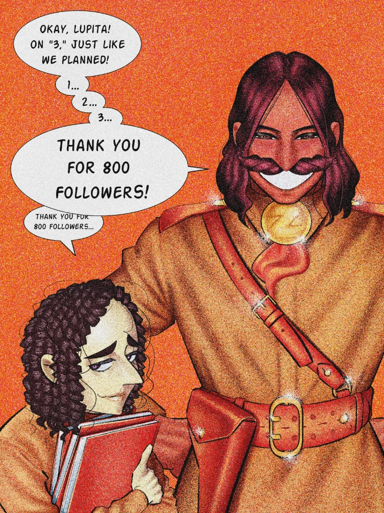
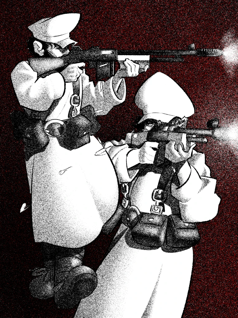
Their names are Lupita Crespo (left) and Armando Azarola (right).
Armando served in the War of the Two Valleys alongside my other OC, Erasmus Headway:
Armando and Erasmus both witnessed and committed terrible things during the war. It killed them spiritually, but in different ways. Erasmus came to see life's frailty and gained the belief that control over one's own life was equally frail, whereas Armando viewed the war as a transcendental experience, which raised him to new state of being. Armando would go on to become a "man behind the curtain" for his country's military complex. Erasmus, believing the only thing worse than being a cog in the machine was being the one who's pulling the levers, resolved to stay at the lower levels of service.
Lupita is Armando's secretary. Her naturally curled hair and gleaming purple eyes mark her as an ethnic Roilangan, a descendant of the same people who Armando and Erasmus fought for, and then against. Their country, Volkenbourg, has housed an ethnic Roilangan minority for close to two hundred years. The Roilangans who made their home there, primarily on the coast, came as a merchant class and opened up the Volkanii people to a global trade network.
When the Roilangan Empire set their sights on conquering Volkenbourg, the Volkanii government briefly considered mass expulsion and internment of their Roilangan minority. However, the Roilagans there proved themselves when they collectively volunteered their own merchant vessels to be fitted with armaments to create an impromptu navy. The majority of those same Roilangans would defend the Volkanii coast for the entirety of the war. These ethnic Roilangans, referred to by some as "the Roilanii" did these things, because they themselves were trying to escape the heavily stratified social structure of their own homeland.
Despite all this, and the fact that many ethnic Roilangans faithfully occupy government positions, some in Volkenbourg meet their Roilangan counterparts with great skepticism and scrutiny, and the reality of war crimes against many ethnic Roilangans soldiers and POWs is something the country will have to come to terms with.
Lupita herself is quite awkward, nervous, and sickly. Never the less, she has found herself in a good paying position within the Volkanii Mercenary Division as Armando's personal secretary and aims to dedicate herself as much as she can to the Volkanii Republic.
Read about my other OCs here.
See you around~

Posted by BombsAhoy - March 30th, 2022
Nah, but seriously big thanks to whoever takes the time to choose and decide who gets this status. Much appreciated. I will make a bigger post about it, and a few other things, when I finish a piece I'm doing from my 800 follower milestone, which will also reveal two new OCs.
Stay tuned.

Posted by BombsAhoy - January 6th, 2022
If you're interested in commissioning me, please follow the link to fill out a commission form!
